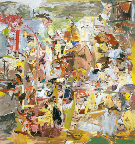
Tuesday, December 8, 2009

Phillip Allen

Phillip Allen,
Between the Soup and the Cheese - version 5,
2009, oil on canvas, 50x50cm

Phillip Allen is a British born painter best known for his unique brand of abstraction incorporating modernist design motifs and contemporary painterly conventions. In a current exhibition at Transition Gallery in London, Allen, alongside Rose Wiley and Jake Clark, is showing a new set of works that represent a stylistic departure from his earlier paintings. Allen chooses an all-over treatment of the canvas yet, like his past work, still explores the delicacies of paint and their relationship to surface. In some of the works a full or partial narrow frame anchors the geometric forms nicely - an interesting and effective evolution from the two deliciously thick icing-like bands typically featured in former paintings. When I first saw these new works I really sat up and took notice because, to be honest, they just make the whole process of painting (arduous layering, gruelling removal, infuriating re laying etc etc) look so easy. Can you tell I'm a little frustrated right now? Seriously...this painter has all the tools and the nuanced visual language to make a beautifully rendered abstract painting. It is also, from what I can glean from my internet research, a style that is quintessentially British (a Prunella Clough legacy, perhaps? without forgetting a Nozkowskiesque nod to the small format, of course) and I'm very much enamoured of what is being made in that part of the world right now like this, and these.

Sunday, December 6, 2009

Sabine Tress

Fire walk with me -2009
acrylic on canvas
160cm x 160cm

Zorg -2009
acrylic on canvas
160cm x 160cm
(images courtesy of the artist)


THE PAINTER SABINE TRESS DURING WORK from Marion M. Hetzel on Vimeo.

Sabine Tress is constantly moving around in her studio whilst painting, choosing her colours in a very sensual way. This inspired me to create a sort of “painting-music-clip”. As much as music is able to create a mood and complete a space, Sabine´s paintings seems to do exactly the same. Colour seems to be omnipresent and traces of former painting processes are visible on the studio floor. It´s like a big “colour-symphonie” in which the paint-pots represent the instruments and the colours stand for the sounds and melodies. To me, being a cinematographer, Sabine´s creative process feels like a sort of dance with colour. I´m fascinated by this slender woman who is gracefully expressing so much power in the way she paints. I also love the way she stops to think or consider what she has just painted and then continues her fluid movements -Marion Hetzel

Hi all. It's been a while, I know. I hope you enjoy this wonderful little video by Marion Hetzel featuring German painter Sabine Tress in her studio. Sabine contacted me about two months ago to thank me for the small post I wrote here and since then we've been electronically chatting away. It's been a treat to talk with someone about painting who happens to live close to the places I would love to visit and the painters I would love to see in the flesh.

Sabine Tress is known for her seriously quirky, colour rich studies of interiors or more specifically living rooms complete with creatures (cushions, lamps, couches) reminiscent of Phillip Guston. Indeed, Sabine cites her painting influences as Guston along with Basquiat and Twombly to name just a few. Like Guston, these paintings are darkly humorous even sinister, kind of hinting at a deeper psychological intent if one cares to look. Sabine Tress is a painter who soaks herself in the visual and then applies through paint her own unique way of seeing the world and I love the world she creates...they make me want to sit around in them, languish in the sensuous colours, peel back the curtain-like layers, so I can take a peek at what lies behind. Watching the video I'm really inspired by the way she is not afraid to splash paint generously over the surface, to cover something that may or may not be working in order to discover something else. It's a lesson I need to learn - to get rid of the stuff that makes you stuck and precious because in the act of erasure there is an opportunity to find something surprising. Indeed, In her emails she says that she wants to be surprised by her painting process and that, I think, is a damn fine objective and she delivers that sense of discovery every time.

Of course, colour, applied intuitively, or specifically mixed, is central to Sabine Tress' work. Coincidently I've just been reading Painting Abstraction: New Elements in Abstract Painting by Bob Nickas and he could easily have had Sabine Tress in mind when he dedicates the third chapter to the idea of colour becoming structure in painting - where colour is a 'fundamental building block' or a painting's central subject. True to form, her recent work (find more here and also at the end of the video) is colourful and ever playful - utilising strong floating lines against swathes of colour swatches -but it's also unruly which is what makes these works compellingly complex and dynamic. I really sense her desire to push things further- surprise herself even more. To extend Marion Hetzel's music metaphor, If Sabine Tress's early semi- abstract works could be likened to a cool funky jazz fusion the latest more non - representational offerings are deliciously brazen, rule defying, punk. I can't wait to see what comes next - Sabine Tress is a painter to watch.

Thursday, November 5, 2009

My website - finally!

I've finally completed my website. It's very simple and I only have a few works on display but it will be updated as time goes by. This is such a new thing for me. Even putting my name on a website gives me the horrors, let alone putting my work on display - but it needs to be done. Let me know what you think of the design or make some suggestions if you feel like it.

Saturday, October 24, 2009

Cecily Brown

Cecily Brown: Thanks, Roody Hooster -oil on linen, 2004

I think I might let the artist speak for themselves this time. Here's an interview with Cecily Brown which I found via Two Coats of Paint.

The boundaries of painting excite me. You've got the same old materials - just oils and a canvas - and you're trying to do something that's been done for centuries. And yet, within those limits, you have to make something new or exciting for yourself as well as other people.... Read more

Thursday, October 22, 2009

Ken Whisson

Ken Whisson
House, Hills, Poultry and Trees
30.7.08 & 21.2.09 100 x 120cm

Image: courtesy of Watters Gallery


"If one acknowledges that the style of a Whisson painting is unmistakable, this is not to plunge the artist into a creative cul-de-sac. One of the reasons these pictures are individually so engaging and cumulatively so haunting, is that the problems they deal with are never predictable, their shapes never purely rhetorical. Each work has its own crisis to overcome, its own pictorial language to invent" from: John McDonald -
Ken Whisson, A Survey catalogue

Love this quote. Love Ken Whisson. Let me try and articulate. Every so often I'm visited by that vexed question: Is painting dead? To cure me of such impure thoughts I'm always heartened by an idea (not just mine, I'm sure) that for every individual who paints there is a personal question each must seek to answer through their work. Perhaps I might even go so far as to say that sometimes those questions are so much better when they're not or never truly answered thus providing a painter with enough sustenance for a lifetime. Ken Whisson is a much loved Australian painter precisely because he revisits old territory in a way that never feels old or rehashed. It's always fresh - not just with respect to paint handling which, if you are lucky enough to see one in the flesh, is quite a special experience - but always because there seems to be an importance placed on the journey rather than the final outcome. Hence the scruffy, scumbly marks, the layered staccato lines drawn with paint that are smudged or half concealed and those strange shapes that hang, usually in white space, delightfully and necessarily unresolved. A life lived through painted marks. Perfect. I'm cured.

Friday, September 18, 2009

Gabrielle Jones - dialogue with paint

Gabrielle Jones
'Night Storm'
2008, 122 x 152 Oil on Canvas
Image courtesy of the artist

The other day I had the pleasure of visiting Sydney artist Gabrielle Jones in her studio. We had lots to talk about. So much so that on my train trip home I madly scribbled recalled snippets of our conversation, covering three blank end pages of my current read - Night Studio: a memoir of Philip Guston.

A natural colourist, Jones' abstracted landscapes are taken from memories of shape and space in nature. She is an interesting mixture of an intuitive painter and one that makes considered decisions about how colour and form should combine. These paintings offer her own unique view of the Australian bush in all it's extremes -hot and sun drenched; dry, restful, cooling shade.

Jones related to me an early lesson she learnt at art school which was to allow a painting to take her where it wants to go. Clearly it's a lesson that works for her style and her painting process. Although periodically she draws from life, her main sustenance for subject comes from her memory. The main work in each painting comes from decisions she makes as the work grows before her ( each work springs from one primary painting and so there is a constantly active process of looking and re imagining). It's about the conversations she has with herself and the painting materials - canvas, brushes, paint - that seem to concern her most.

Jones seems to revel in formal elements such as the ambiguity of a shape. Also, space as a counter point to shape, is just as important. Her use of white might be something to do with this nuance and, to my mind, helps to tie her surfaces together so that they feel both weighty and light all at the same time. There is a meatiness to her paint too which I really like and we spoke for a long time about the way the edges - the spaces between two shapes or the meeting of two tones of colour - can keep a painting buzzing with tension or, in the case of some of her identified 'failures', leave a painting feeling predictable and deadened.

"Of course, I'm still learning to paint" she maintains. From this statement I get that Jones is willing to push paint around, ask it questions and grow as an artist in that process. Gabrielle Jones is a painter who knows her stuff and can speak the language of paint with real insight. Visit her website and her blog too where you will find her interesting ruminations about art and life as well as a wonderful collection of quotes from other artists.

Gabrielle Jones has an upcoming show: "Trees for my Father" depot II Gallery, 2 Danks St Waterloo Nov 3 -15 Drinks with the artist Wed Nov 4 6-8pm


Wednesday, September 9, 2009

Paint revelry


Ross Laurie
Time and Light
Oil on canvas
1070 x 1400mm
2009
A quick post to sing the praises of two Sydney artists who have shows on at the moment.

Steven Harvey @ Liverpool Street Gallery and Ross Laurie @ Damien Minton Gallery. Both shows simply revel in paint, colour and form. Steven Harvey, in his paintings from Kakadu, continues to play with the double canvas construction so that the edges of the paintings are just as worthy of attention as the facing surface. I'm all for interesting edges and I'm always looking at them; a fascination for the 'history' of a work, I guess. Go look.

Ross Laurie's paintings and works on paper, from his home town of Walcha, literally sing with seductive colour. Painted forms, depicting trees, undulating curves and the shadows created by their interplay, are beautifully rendered and resolved.

Both of these artists have created works that are fresh, seductive and just about edible. Enjoy!

Saturday, August 29, 2009

John Peart

Shadowgrille - 2009
120x194cm
oil and acrylic on canvas
Image: Watters Gallery, Sydney

Just the other day I had the opportunity to meet with Sydney abstract painter, John Peart, at Watters Gallery where we had a rambling conversation about his latest show Mainly Painting. Comprised mainly of large canvases made from smaller panels, the work is full of intrigue; amorphous forms, spidery lines and surfaces ranging from roughly textured to lightly stained. These are the kind of abstract paintings that keep me looking, guessing and wondering.

Talking to Peart was a refreshing experience given that it was quickly obvious that he was open to my interpretations. Indeed, when I asked him if he liked talking about his work he reflected 'not so much talking about it but I do like being prompted by questions from others, it makes me think about possibilities'. This flexibility; being open to questions and possibilities, is key and it's clearly evident in the way he treats each panel separately and then unifies or assembles them later, into larger canvases. Doing so welcomes a sense of surprise and play that provides a freedom from being entirely preoccupied with picture making as an end product. It's more about engaging with the paint and its myraid possibilities. On a smaller scale the collages in the show echo this process and, to my mind, represent a playfully direct way of juxtaposing bright amorphous forms with web like grounds.

Space is a major element in Peart's work. In a painting such as 'Pour Favour' (please?) there is a distinct feeling that one can fall into or through spaces or holes, as if there is another world behind the prevailing layers.

In 'Shadowgrille' (featured here) space is suggested by playful lines: some scrathy, as an overlay, some flat and inky and some fuzzy/blurry on top. It's as if a paint soaked grub took a wander along the surface leaving a trail like the marks one might find on a scribbly gum. I'm naturally drawn to the tensions set up by multiple edges in this painting, an effect resulting from the joining of the four separate panels post-painting. To add further to its complexity, Peart concocts a subtle shift in the character of the line so that it changes from deep dark to grey blurred. The overall effect is intensely dynamic; the viewer is not passively gazing but rather actively moving in and out of the picture space.

Echoing Shadowgrille is a wall sculpture. Made from eucalyptus branches, 'E camaldulensis' first comes across as a random scattering of bush debris on a forest floor but further investigation reveals a series of driving lines that splinter off from the base, weaving in and out to make a support of wooden webs or grids. It's a form that is beautifully resolved and as it hovers airily on the wall the branches cast shadows affecting a second dimension on to the blank space behind so that the entire piece takes on a kind of physical reflection of the concerns embodied by the paintings surrounding it.

The idea of endless choices in painting is such a delicious one. And, dare I say it - pursuing substance over style - is what a painting by John Peart is all about. I can't wait to see what he comes up with next! So if you're in town, I highly recommend that you go and see this show. Also, you can read a really great interview from 2007 with John Peart here.


Wednesday, August 19, 2009

Sabine Tress


Living Room Creatures, Grey eats Red - 2007 - Acrylic on canvas - 100 x 100 cm
Image: Galerie Proarta

German painter Sabine Tress knows how to apply paint and she does it playfully, boldly and sensuously. In every picture she makes there is a freshness that allows the shapes to settle without them becoming stodgy or obvious. I'm intrigued by what lies beneath the great swathes of colour - what goes before in these paintings are just as much a part of the final result and the layers never feel heavy or over worked. This painting is part of a series called Living Room Creatures. Go and have a look at the whole set - they make me laugh out loud! Her earlier graffitiesque works are also a treat.

Wednesday, August 5, 2009

Ian Fairweather

I was in Darwin recently where I photographed this lone, weathered chair. The negative spaces and the lines reminded me of the work of Australian artist Ian Fairweather who, in 1952, made a raft and launched himself into the Timor sea from the very beach where I took this shot. Most people who know anything about Fairweather are familiar with this journey in which he drifted dangerously for weeks before landing in Indonesia. He is known for his style that, while blending influences from cubism, aboriginal art and chinese calligraphy, offered us something so wonderfully unique especially considering that most of his best work was completed in isolation from the art establishment of the day. Fairweather was a restless traveler and later a recluse painter, choosing to paint out the rest of his days on Bribie Island, off the Queensland coast. But, putting myth making matters aside, a Fairweather painting is, to any painter, a treat to behold. It's all about those restless marks that dart and weave all over the support (which is most often cheap cardboard). These are works that truly make one want to dive in. Fairweather creates densely layered and disrupted surfaces that, when one casts ones eye across the picture, has the sensation of settling for a moment in quiet spaces or anchor points of line, shape or colour before being propelled onward - like a kite, I suppose. I love that feeling of delicious movement in every rapid fire stroke or wandering line. I'm never far from the idea that I'm witnessing a language, a very personal communication system containing fragmented memories of far off places or conversations with vines, undergrowth, strange animals or landforms. These paintings reveal a rich, personal world of a very great and brave painter.

In his own words: Painting is a personal thing. It gives me the same kind of satisfaction that religion, I imagine, gives to some people.

Well, amen to that!

House by the Sea 1968


Flying Kite 1958
Sytnthetic polymer paint and gouche on cardboard


Saturday, July 11, 2009

Undoing painting

An interesting take on the painting process by artist Andrew Long. Making paintings without a support system. I love it!


Video: Andrew Long

Friday, July 10, 2009

John Millei


Procession 109, 2005
Oil on Linen
20"(H) x 24"(W)
Image: Ace Gallery

I've been waiting...waiting...and, you guessed it, waiting for another show by the artist John Millei. See his work here and marvel at his impeccable ability in a staggering range of painting possibilities. The group that this image comes from reminds me of pared back Morandis. Figures (bottles?), directly rendered in beautiful clean colours, rise from the picture plane as if taking a bow on stage.

Friday, June 12, 2009

Paul Higgs


Paul Higgs
Paint Construct E 2009
wood, fabric & mixed media on paper
78 x 103 cm
Image: Stella Downer Fine Art

Here is an artist who I've admired for an age yet never really been able to experience until recently when I saw his work first hand. Here's an image from Paul Higgs' upcoming show. He calls these painting constructions (not collage) which to me is such a delicious term because it captures exactly what painting implies; that being both a cognitive and intuitive process of placing and pushing elements of line, form and colour. Collage (or in this case, construction) has everything to do with the painting process and it bridges a gap between what can erroneously be defined as the separate disciplines of painting and drawing. In my own practice I frequently find myself obsessively hording failed bits of painting or drawing, or scraps of paper painted with left over colour which I rip and place; experimenting with combinations I might not have the guts to go through with on canvas. Whether or not these become works in their own right they almost always provide a solution for a tricky painting problem.

Here's more about Paul Higgs from his upcoming show:
" .....a tense and surprising music like, considered balance of complex opposites. The inert and the frenetic, energy and rest, harmony and dissonance, all find unity in these energetic, playful and joyous compositions. His paintings and mixed media paint constructs are a testament to his commitment to abstraction.
HIGGS' works are a vigorous repartee between colour, line, texture and movement.

Saturday, May 30, 2009

Manu Baeyens

Je compte l'ensemble des antennes de l'herbe
(I count all branches on the grass)
mixed media on wood
50h x 40b x 2d
2009

I have been frequenting flickr lately and am amazed and inspired by the talent of the painters that inhabit it. Here I was thinking that flickr was mainly for photography. One artist I have been looking at is Netherlands artist Manu Baeyens. I love his quirky sense of colour and rhythm. See for yourself.

Monday, May 11, 2009

Kill Pixie


I couldn't find a title for this but check out the work of Kill Pixie, an Australian graffiti artist. Unless you've been living under a rock you would be well aware of this guy's star status. I'm drawn to the originality of his vision, the obsessions to detail, patterns and those lurid colours.

Jamie Shelman

"Untitled", acrylic on paper, 38x 50 in. 2006

Ok. I hang my head in shame. The frequency of my posts are just lame. I know. I'm inspired every day with what I see around this online universe and I really have been very selfish by not sharing. I'm just going to post whatever takes my fancy. Jamie Shelman is a painter and an illustrator. I think the freshness of her painted surfaces are quite stunning and beautifully resolved.

Saturday, April 25, 2009

Minnie Pwerle


Minnie Pwerle
Awelye
2005
Synthetic polymer on Belgian linen


Minnie Pwerle
Awelye Athwengerrp
2005
acrylic on linen
56 x 56 cm


Please enjoy these stunning paintings by the late Minnie Pwerle, an Australian Indigenous painter. I have a yellowing and tattered magazine image of one of her paintings on my studio wall and it inspires me every day. From a formalist point of view, Pwerle's treatment of surface is entirely contemporary; layers of pigment suggest the rippling effects of wind on sand or tidal waters through kelp.

Her distinctive style used linear brush-work based on the body painting used for important women's ceremonies in her native country of Atnwengerrp. She painted with a rich array of colours and her work contained a compelling visual and spiritual power.

All the stories she painted conveyed her deep connection with the land, and knowledge of the foods that it provides. (quoted from Wikipedea)


Saturday, April 11, 2009

Sunday, March 15, 2009

Paul Corvers


120 x 100cm
oil on linen
Image: courtesy of the artist

I found this painter over at dripbook. Also, check out his website for more accurate images as this one doesn't seem to want to post properly. I love the simplicity of his work.


Ken Weathersby

163 (d & g)
2009
Acrylic & Graphite on Canvas over Panel, with Removed and Reversed Areas
32" x 41"

Two sided painting.

I am a hedonist when it comes to painting. You can probably tell by now that I love the meatiness of paint, the way it looks and reacts. Which is why I was surprised by my attraction to the seemingly 'paintless' works of Ken Weathersby. Go look. This guy pays serious respect to the history of painting. (Where a dialogue takes place in which we consider that painting has made a break from it's function as an illusion of reality to being a function in and of itself - that of being a set of forms on a flat surface with four sides; dare I say, an object, conceptual or otherwise, to hang on a wall.)

A while ago I made reference to the fantasy of getting in and behind brushwork -to wonder how the artist has technically made a painting. Is the average punter likely to do that with painting today? Certainly, whilst once offering technically proficient representations of other worlds to marvel at, I wonder if painting today gives us a lot to think about and look at - but rarely a surface in which we're meant to get beyond. With Ken Weathersby's paintings we can do all this and more. Literally his figure (the viewer?) is diving into the painting, giving new meaning to the figure/ground relationship.

In this work (and others on his website) one can enjoy the reversed side. I wonder. Is this a double wink aimed at consumerist sensibilities where surface image is supreme, and painting itself. A two for the price of one deal. The banality of plaid sits neatly against meticulously worked wood panels; as if the two could represent something from a family man's workshop in the 1950s. Homely, bland, safe - a message to consumer (surface) culture; perhaps a salve for art onlookers, weary of abstraction and it's many confusing conundrums. But have a little read of his blog. There's a lot going on in his head which I make no claims to understand. What I know is that I like Ken's questioning and his attempts to offer answers to the beautiful puzzle that is painting.

Ken's work reminds me of this artist, Steven Harvey who, also preoccupied with questions of how to push painting to another level, has produced some really interesting pieces.

Saturday, March 7, 2009

Raquel Mazzina

"Blue Stroll" 50.5 x 61 cm - oil on canvas

Here's a painter who I came across just recently and wanted to devote a quick post too. These are really powerful and very beautiful. Slabs of paint seem to be literally driven across the canvas; no dainty dabs here. While layers of colour suggest the geomorphic structure of land there is an emotional quotient embedded in each buttery stroke of the the brush/palette knife. These paintings fairly heave and shimmer despite the thickness of paint. You can find more of Raquel Mazzina's work here.

"Chevron" 122 x 92 cm - oil on canvas

Tuesday, February 17, 2009

vittorio colaizzi

It's common knowledge in certain art worldy circles that a yellow painting never sells. I've been witness to these feverish whisperings. Yellow is just plain twee and won't match the decor. Shocking!

I can't disagree more. There's something about the colour yellow that always satisfies me when I paint. It pulls a picture together and activates the whole surface. I can be making mud pie then I add yellow and hey presto - a seductively satisfying balance with a certain zing materialises. Hmmm... a trite observation perhaps but, well, you know what I mean.

A painter that uses yellow with aplomb is Vittorio Colaizzi. Oh boy, how that yellow wave tingles my senses. I'm always returning to have a look at his work over on release form, a great painting blog .

Unlike the previous post these pictures are not always easy to digest. A refreshing quality in any painter, frankly. A painting, when easy on the eye, just bores the eye.

Let me explain.

On quick inspection the crisp shapes seem too easily placed. But then you notice a white space here, a scratchy unfinished brush mark there and suddenly bam! your eye begins to take in unusual and surprising placement of forms. Likewise the treatment of the painted surface, although not easily read in a jpeg, suggests a rigorousness only seen in intelligent painting.

There is a sense of paintings history here. Dare I mention 'formalistic concerns' without rousing the Greenburgian detractors humphing over there in the corner. But this is exactly what attracts me and VC fulfills the whole brief. Placing colour, juggling form, pushing paint, thick or scrappy. Decisions about when to stop doing all of these things - when to stop so that painting remains fresh, not a dead weight, is what he is master of.

Now, go look.

Saturday, February 14, 2009

Leslie Baum

Unfortunately the artist has removed image link

Here's a Chicago based painter I'm absolutely drawn to and I can't stop thinking about the message behind her works. I first learned about her over at dear ada - a really sweet blog with a heart warming brief. Go check it out.

A sense of doom and imminent decay comes juxtaposed with gorgeous light washes and sumptuous cubes of candy colour, (is that a liquorice allsort popped on top?). I'm reminded of some primordial world - ancient ruins possibly - which, despite their rich and shiny structures, have slumped. Blood or a fierce hot sunset stains the white spaces. Prophetic perhaps? I won't be fooled by the surfaces of these paintings. They may be easy on the eye but here I detect a sinister barb. I'm looking forward to seeing more of her work.

Thursday, February 12, 2009

Varda Caivano

Untitled 2007 Oil on canvas 70 x 51 cm


Here is a painter I have been wanting to dedicate a post to for ages. I came across her work in an old Modern Painters Magazine two years ago. I'd love to know when or if she'll be having a show again. You can see her work here and here.

This is a picture I just want to savour - get up close, lick each pane of tasty colour. Paint application is frenetic, impatient, refusing to conform. And shapes move forward or beyond the picture plane; never settling. I'm reminded of crushed velvet. I just can't pin it down. A view within a view within a view within a view within a view..........

Wednesday, February 11, 2009

looking around

Dear reader, if you're still out there, please forgive me. I've been plenty busy with all sorts of crazy things, which is why this blog stagnated for so long.

I'd love to post more work from painters who are, as yet, unrepresented or just emerging. Feel free to email me or leave a comment with a link to your blog/work.

What am I looking for? From the works I've posted so far you can probably tell what catches my eye. But I'm open to the bigbad universe of painters everywhere-

So...let's get this party started!

Joe Furlonger


Joe Furlonger

Travelling amid Mountains and Streams
2008
Acrylic, pigment and binder on canvas
182 x 91 cm

Master of the brush...what more can I say. Except maybe this: If I were a believer, God would be velvet moss green. These paintings make me swoon. Delicious layers of liquidity - lovingly and oh so respectfully applied. Nothing is under or over done. These sing. I'm diving in! Check more of his work here.

The paint has finally dried. Welcome to 2009! I'm ready to comb the big wide virtual world of painting again. Stay tuned for more tasty delights. Peace.
Related Posts Plugin for WordPress, Blogger...