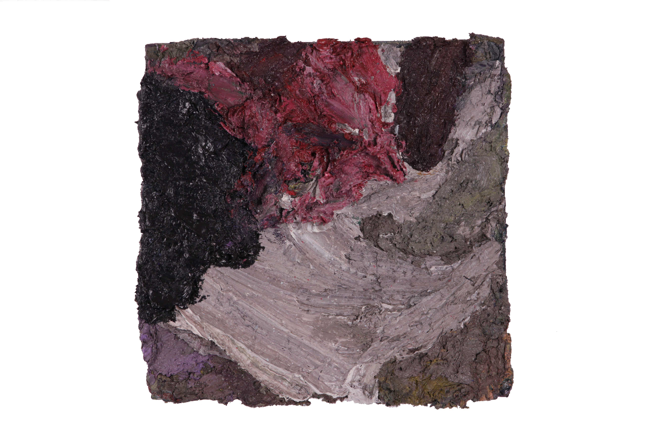
Showing posts with label abstraction. Show all posts

Thursday, June 23, 2011

John Peart


Moment 1, 2011
oil on canvas
175 x 175 cm

John Peart, one of Australia's best contemporary abstract painters, is having a show of his latest crop of paintings, some of which faithfully reference his very beautiful series of collages from 2010.  Large, bold and rhythmic, these paintings are so intriguing for their scope and also for their simple and direct freshness. Literally I feel like these paintings pulse on the walls. See what I wrote about Peart's work in 2009 here. If you are in Sydney the show opens tonight at Watters Gallery and continues on until the 9th July 2011. Well worth a look!

Sunday, March 20, 2011

Judy Ledgerwood


Hot Sun Cool Shade, 2010
Oil on canvas, 15 x 15 in

'the tensions between decoration and abstraction'. Good reading here (scroll down)

Sunday, November 21, 2010

Lesley Vance

Untitled (41), 2010
oil on linen
27.9 x 22.9 cm

I came across Lesley Vance's work a while ago. They are moody dark, velvety abstract compositions. Veils of paint are densely layered and appear to be applied in a variety of ways. They remind me of Caravaggio doing abstraction.

In her own words: My paintings originate from still lives of natural forms composed in the studio: I put together an arrangement of objects from my collection in a box where I control lighting by cutting openings for light to shine through. I'll paint this image, and once it reaches a certain point of resolution, the composition begins to evolve and I'm no longer looking at the source material. From there the the surface becomes a malleable space as the objects dissolve into pure form, although traces of the original image frequently remain in the finished work....

read more here about Vance's intelligent and intriguing process as well as her varied influences.

I love the process Vance uses and the results are gorgeous jewel-like paintings.

Thursday, November 18, 2010

Anthony White

Fugitive
50 x 50cm
oil on linen
2010

A show of Anthony White's will be held in 2011, which I'm looking forward to. I've posted about Anthony's work before purely and simply because I love his obvious passion for paint. He will be taking up a residency at The Leipzig International Art Programme. Lucky him! I can't wait to see what he produces.

Saturday, July 3, 2010

...not a statement - Douglas Witmer

....not a statement by Douglas Witmer

Tell the birds -2009
Black gesso and acrylic on canvas
28x22inches

Fruitville - mixed media on wood

I found the work of Douglas Witmer online some time ago. On reading his 'artist statement' I was instantly captured by the circular structure and the simplicity of his words about painting and what it is (or isn't). When I recently got in touch with him to ask if I could post it here he told me that the words took him some time to write. To my mind the best 'artist statements' have clarity and need to get straight to the heart of an artists practice -even if they do take time to write - and Douglas Witmer certainly writes clearly and simply about his process. His insights into the nature of painting are thought provoking and particularly meaningful for abstract painters where the task of negotiating a position; attempting to work in a relevant and fresh way, can be difficult. Indeed, to put these challenges into words is a personal thing but also, when overdone, can become meaningless and detract from the work. Visit his website to look at his paintings and mixed media on wood. Like his words, his work is a direct and honest inquiry into the nature of paint and the surfaces on to which he applies it.


Douglas Witmer's current show, "Fruitville", can be viewed at Some Walls, Oakland CA, June 20 - July 25th 2010

Sunday, April 25, 2010

Amy Sillman


For those who live under a rock, Amy Sillman has a new show up at
Sikkema Jenkins & Co. Video courtesy of James Kalm - it's the next
best thing to being there. Thank you James.

Sunday, January 31, 2010

Mali Morris

Bird Ghost - 2007
122 cm x 153 cm
acrylic on canvas
Image: courtesy of artist

Buried Scarlet - 2009
26 cm x 31 cm
acrylic on canvas
Image: courtesy of artist


It's official. It seems I have been living under a rock - otherwise, how else is it possible for me to have missed the wonderful, luminous works of the London painter Mali Morris. Really, these are so breath taking. Look at them; simple, clean colours that sing, generous brush work, fresh surfaces that are deep enough to dive into, yet never overworked - these are the works of a longstanding gifted and intelligent painter; they provoke a conversation between the viewer and the paint.
Predominately working small with acrylic on canvas, Mali Morris' process might resemble that of an excavator - starting with the application of rectangles of colours, overlaying these with lush broad strokes of colour glazes and then wiping away parts to reveal what lies beneath. With her process Mali Morris seeks to find rather than add colour. It's a delight to see a painter who can balance bright geometric forms with gestural abstraction and be able to pull the two formal elements together with such ease. I'm so enthralled that I've immediately ordered the latest issue of Turps Banana which features an essay about Mali's work by Peter Suchin. (There's also an interview with Thomas Nozkowski!)

Mali Morris is a painter who makes you think about paint, and whose paint asks you to think about light. She is not concerned with making paintings represent recognisable objects, but the world, through light effects, is in her paintings... Her paintings are alive not just to a history of abstraction, but in a dialogue with her own method of experimentation. The issues seem to be light and rhythm, and what painting is - From the catalogue essay ‘Strange Links: Giude to Morris'2008, by Matthew Collings, artist, writer, critic & broadcaster; author of This is Civilisation 2008 Read more here
I could not have put it better myself.

Tuesday, December 8, 2009

Phillip Allen

Phillip Allen,
Between the Soup and the Cheese - version 5,
2009, oil on canvas, 50x50cm

Phillip Allen is a British born painter best known for his unique brand of abstraction incorporating modernist design motifs and contemporary painterly conventions. In a current exhibition at Transition Gallery in London, Allen, alongside Rose Wiley and Jake Clark, is showing a new set of works that represent a stylistic departure from his earlier paintings. Allen chooses an all-over treatment of the canvas yet, like his past work, still explores the delicacies of paint and their relationship to surface. In some of the works a full or partial narrow frame anchors the geometric forms nicely - an interesting and effective evolution from the two deliciously thick icing-like bands typically featured in former paintings. When I first saw these new works I really sat up and took notice because, to be honest, they just make the whole process of painting (arduous layering, gruelling removal, infuriating re laying etc etc) look so easy. Can you tell I'm a little frustrated right now? Seriously...this painter has all the tools and the nuanced visual language to make a beautifully rendered abstract painting. It is also, from what I can glean from my internet research, a style that is quintessentially British (a Prunella Clough legacy, perhaps? without forgetting a Nozkowskiesque nod to the small format, of course) and I'm very much enamoured of what is being made in that part of the world right now like this, and these.

Sunday, December 6, 2009

Sabine Tress

Fire walk with me -2009
acrylic on canvas
160cm x 160cm

Zorg -2009
acrylic on canvas
160cm x 160cm
(images courtesy of the artist)


THE PAINTER SABINE TRESS DURING WORK from Marion M. Hetzel on Vimeo.

Sabine Tress is constantly moving around in her studio whilst painting, choosing her colours in a very sensual way. This inspired me to create a sort of “painting-music-clip”. As much as music is able to create a mood and complete a space, Sabine´s paintings seems to do exactly the same. Colour seems to be omnipresent and traces of former painting processes are visible on the studio floor. It´s like a big “colour-symphonie” in which the paint-pots represent the instruments and the colours stand for the sounds and melodies. To me, being a cinematographer, Sabine´s creative process feels like a sort of dance with colour. I´m fascinated by this slender woman who is gracefully expressing so much power in the way she paints. I also love the way she stops to think or consider what she has just painted and then continues her fluid movements -Marion Hetzel

Hi all. It's been a while, I know. I hope you enjoy this wonderful little video by Marion Hetzel featuring German painter Sabine Tress in her studio. Sabine contacted me about two months ago to thank me for the small post I wrote here and since then we've been electronically chatting away. It's been a treat to talk with someone about painting who happens to live close to the places I would love to visit and the painters I would love to see in the flesh.

Sabine Tress is known for her seriously quirky, colour rich studies of interiors or more specifically living rooms complete with creatures (cushions, lamps, couches) reminiscent of Phillip Guston. Indeed, Sabine cites her painting influences as Guston along with Basquiat and Twombly to name just a few. Like Guston, these paintings are darkly humorous even sinister, kind of hinting at a deeper psychological intent if one cares to look. Sabine Tress is a painter who soaks herself in the visual and then applies through paint her own unique way of seeing the world and I love the world she creates...they make me want to sit around in them, languish in the sensuous colours, peel back the curtain-like layers, so I can take a peek at what lies behind. Watching the video I'm really inspired by the way she is not afraid to splash paint generously over the surface, to cover something that may or may not be working in order to discover something else. It's a lesson I need to learn - to get rid of the stuff that makes you stuck and precious because in the act of erasure there is an opportunity to find something surprising. Indeed, In her emails she says that she wants to be surprised by her painting process and that, I think, is a damn fine objective and she delivers that sense of discovery every time.

Of course, colour, applied intuitively, or specifically mixed, is central to Sabine Tress' work. Coincidently I've just been reading Painting Abstraction: New Elements in Abstract Painting by Bob Nickas and he could easily have had Sabine Tress in mind when he dedicates the third chapter to the idea of colour becoming structure in painting - where colour is a 'fundamental building block' or a painting's central subject. True to form, her recent work (find more here and also at the end of the video) is colourful and ever playful - utilising strong floating lines against swathes of colour swatches -but it's also unruly which is what makes these works compellingly complex and dynamic. I really sense her desire to push things further- surprise herself even more. To extend Marion Hetzel's music metaphor, If Sabine Tress's early semi- abstract works could be likened to a cool funky jazz fusion the latest more non - representational offerings are deliciously brazen, rule defying, punk. I can't wait to see what comes next - Sabine Tress is a painter to watch.
Related Posts Plugin for WordPress, Blogger...